
 |
| 24" x 16" |
 |
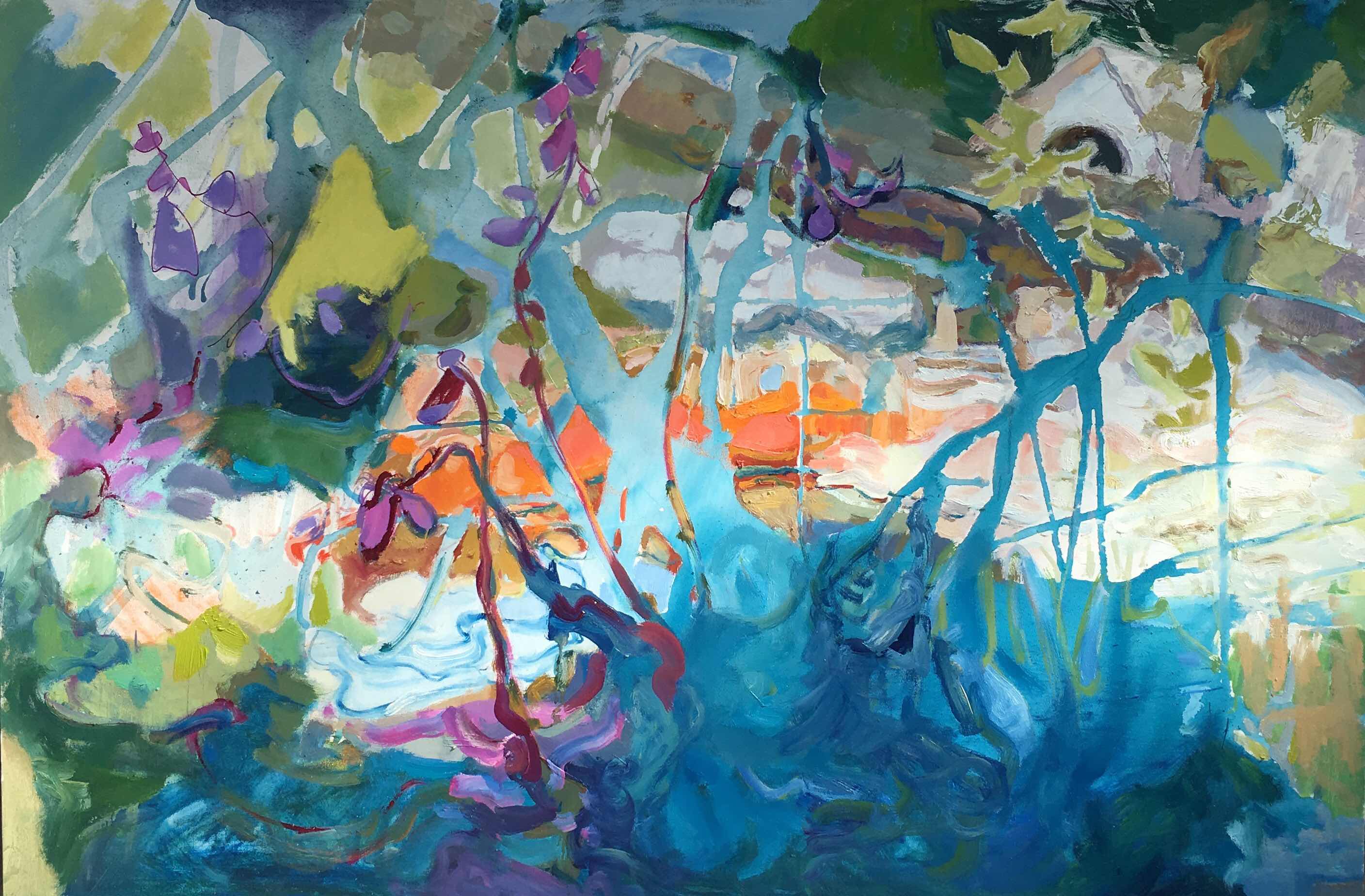
| 40"x 60" |
My 1960 abstract had dominate blue lines in front of firey color similar to my Ritner Creek painting.
Early in developing Ritner Creek painting I enjoyed a journey without a formula or procedure other than working all over the surface. Mostly invented with happy abandon, I proceeded. But as I neared covering all 40 by 60 inches, I was unsure of my final steps. Usually I would sketch linear diagrams. I didn't need to because I remembered I had painted a picture with some similarities.
I had been working with little self-critiquing between 8:00 AM and 10:00 AM for several weeks little by little the abstract took on color, texture and recognizable subjects. I dabbed paint in the spaces between the existing blue lines. I was avoiding tightening up as I worked within the boundaries of the lines by dabbing the paint and not exactly filling the shape.
Stiff, forced shapes and line are lifeless. In comparison to the rough shapes that were intended to be behind the branches the blue shrubbery started looked stiff so I applied thicker paint over the acrylic faster and faster with little attention to staying within the line. The blue paint overlapped the background on purpose. The paint was thicker than most of the background increasing the impression that the cool blues were in front of the warm oranges.
Both the early abstract and Ritner Creek paintings contain features from nature. The abstract has cloud shapes and warm colors like fire. Unlike the early abstract the Ritner Creek has recognizeable nature and architecture arranged in a natural sequence of foreground, middle ground and background as seen in nature. Drawn perspective became important. In this painting I made a concession to realism marking symbolic lines of the path of the water. A realistic stream requires suggestions of where the river bank is.
Time to judge how busy I want the painting to be. Time to compare the lines with those in an older painting. All the existing lines are put in question. I wondered how much movement and how fast the movements can be and still have a the painting comfortable from a viewing distance within my home. Did the lines that formed acute angles look like the branch was broken? Did I want to create the impression that the hotter than usual July was devastating? No!
I wanted an aging, stressed landscape that was beautifully striving to adjust and live.
The lines in my early abstract are controlled, sure and fresh. In the Ritner Creek painting the lines change direction and crisscross. These lines express another feeling and another narrative. I reviewed my initial intention on location.
Keeping my first impression from painting at Ritner Creek:
Under the shadows of the huge oak trees a cool tangle of blue flora symbolically opposed the warm shallow water. I felt energized, young and awed. Not broken! So the zigzag forest green line had to go. Large color zones were joined to simplify and slow down the linear speed.Another technical challenge has presented itself as I lightened some of the darks here and there dispersed throughout the painting attempting to simplify the color areas, the whites became more like pastel colors. Perhaps I should say tints instead of pastels. Pastel painting is now recognized as being equal to watercolor, acrylic and oil painting.
Yesterday, I felt some background areas were too precious to paint over them with more blue shrubbery. I turned the painting upside down and painted more thriving life into branches with curves more like my early abstract painting. Also shortened one vertical twig adding three other vertical twigs because vertical lines slow down the movement making it more comfortable for viewing in my small house.
The painting is not perfect. Small imperfections are life giving. I am calling it finished for now. I can't wait until the oil is dry enough to hang the painting up inside the house, then live with it until I see if it creates Ritner Creek atmosphere. I fear when I bring the painting indoors that the colors will look much darker. Also will the rough brush strokes be too busy for close viewing. Such are the questions I have as I consider cataract surgery. Maybe after surgery dark colors will be more vivid indoors. Or maybe cataracts are a bonus to my creative impressions.
 |
| Midway |
 |
| Finished, maybe |
2 comments:
Because you gave the background to this I can understand it. I have a problem with abstract in understanding. Picasso was the only one who made me see where he was going. I do think these are both compelling and energetic, but I also wonder what the surgery will reveal. Good luck with that. I read recently that it is 94% very successful.
Thanks Tabor for the encouragement.
Post a Comment