Comments, relating to the topic, are welcome, add a great deal to a blog, but must be in English, with no profanity, hate-filled insults, or links (unless pre-approved) To contact me with questions: rainnnn7@hotmail.com.


Showing posts with label watercolors. Show all posts

Wednesday, October 23, 2019

by Diane: Brushing up for teaching watercolor workshop

Ten more days for me to get ready for teaching a watercolor workshop Saturday, November 2, at the Oregon State Fish Hatchery and Research Center Fall Creek Art Festival.

This year the workshop will be entirely different in focus from years past. The focus will be on the brush and the marks they make naturally. The marks from a single brush is dependent upon how it is filled with paint or ink, how it is held and moved. The brush marks can be individual to each person. Their desires, skills as well as the paints and surfaces they choose enters into the results. The numerous ways the brush is handled is like a vocabulary is to the writer.

Brushes are advertised as if each brush has a single purpose like liner, blender, mop, round pointed for detail, or long ones for calligraphy. If limited to their advertised label, their full range of natural mark making characteristics are missed. Perhaps the advertising labels are to get more sales. For example, the number 1 liner made by the Princeton Art and British Co. has extraordinary possibilities. When the entire length is rolled in wet fluid watercolor or ink so it  holds its maximum capacity, it is capable of making a line that goes, goes and goes increasingly thin and faint.

 
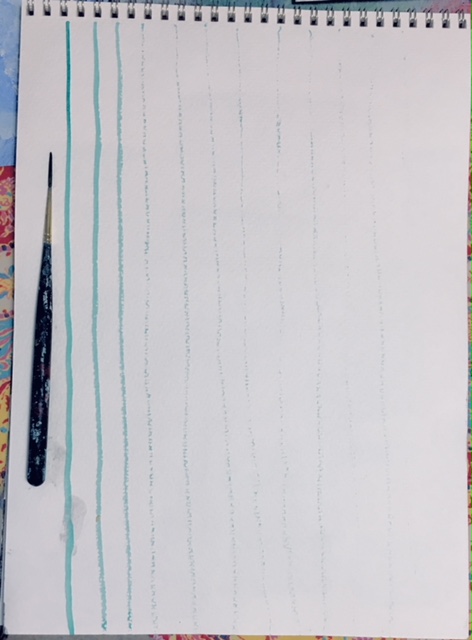
If the 1/8" wide by 3/4" long liner is swiped sideways along its length it makes shapes.
Many lines close together make textural shapes. These two methods are among many ways to use a single brush type. For me personally, getting to know a brush is a springboard to abstracting the subject as well as revealing a story  of how the painting was made.  Secondly, as I become familiar with a brush, I feel  how it might be expressive of how I feel about a subject.
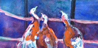
My fourth painting of "Turkeys in the City" has just a few different
uses of the liner brush other than the usual use of it for the rigging on ships or tree branches. The open spaces between the brush strokes makes it easy for me to make major corrections even as the painting is near completion. I just noticed the heads of the turkeys are too large.
  
 
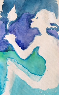
The third painting of Wild Turkeys in the City was painted with a number 12 round Kolinsky Legend brush made from the tail hairs of Russian mink ( in last week's blog I wrote incorrectly that it was sable.) Because it comes to a point it makes good curved feather-like strokes. Also the large brush makes nice big washes. The signature characteristic of the big Kolinsky brush is the round corners from ample wet color stored in the many hairs in the brush's rounded bowl.


The first turkey painting to the right consists of a build up of layer upon layer of washes using the the 1/2" Simply Simmons 1 stroke plat long . During the process I would put a wash on and then leave it to do some mundane household task, coming back for another wash when the painting was completely dry. I became fond of this synthetic hair brush. In this painting I felt it was forced


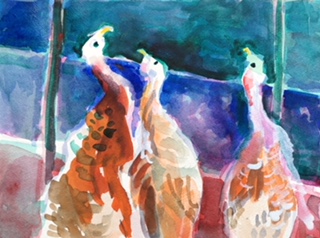
In the second painting of turkeys using the Simply Simmons 1/2 inch flat,  my initial drawing in paint did not go well, so on subsequent layers I was able to draw a new outer edge of the turkeys' heads. The right angle of the brush's tip lent itself to making angular shapes in the drawing and in filling in the background helping to unify the paintings. The lighter early drawing left a nice transition from the very dark background to the very white of the head giving the head a three dimensional form.


Branch with Fruit, Shih T'ao, Ch'ing period
Seeing an exhibit at the  Center Pompidou in Paris inspired my focus for the watercolor  workshop.  side by side were relics from prehistory with abstract works  of 20th century artists.  Prehistory A Modern Enigma reminded me to be mindful of how the marks of tools govern the form of all visual art expression from calligraphy on paper to lettering on stone. From watercolor paintings on paper to silk screen prints.
 The Chinese letter shapes are composed of a number of specially designed brush strokes. The form of alphabets made by the brush are formed in the character of what brushes will do. The letters made by a pen nib and brushes repeated many times take on the different characteristics of the tool that made them. 
Writing with pen or brush also take on the personality of the writer. I want to extend the personal touch to my own painting and inspire students towards their own style in the use of the brush.
 

Wednesday, October 09, 2019

by Diane: Watercolor Workshop at Fall Creek Festival

My tenth year demonstrating and teaching watercolor 

at Fall Creek Festival 

Returning this year is co-teacher, Cheryl French, who has taught and demonstrated with me for about five years. She is a print maker and painter plus she has extensive teaching experience especially with children. The class is made up of all levels and ages. The atmosphere is perfect for families painting together.

The watercolor workshop takes place in the education room of the hatchery with windows on the creek where Fall Chinook and silvers are spawning.


In preparation for teaching watercolor, I am painting and playing with watercolor. It is a medium with many playful possibilities.
Howler monkey mother
12' x 9"
First step
 
Second step - blocking in shapes with a large 3/4" filbert brush -
 a deliberate challenge. The brush's character was my partner.
Without an exact idea of how I would express the  forms,
being mindful of shapes natural for the brush. I allow myself to accept abstractions.
Many steps later
The addition of ultramarine over phthalo green over naphthol red over quinacridone gold
was uneven and not so rich as I hoped.
 

Cupuchin Monkey
The pure white cotton rag paper is good for high contrast.
 I am more comfortable with the starkness of white
when adding a gold tint over most of the whites.
 A concentrated permanent alizarin crimson
over concentrated pthalo green makes a richer dark than ivory black. 
 
The hatchery is surrounded by woods.
This painting is on a warm off white tinted cotton rag paper. 19" x16"
I like the undertone for developing rich darks.

.
A few more weeks remain for me to play.
Also to work with Crayola pan colors
like the ones provided for the class.
Mostly I decide on what I will teach
on the spot depending
on who is in the class.

Play isn't continuous joyful fun.
 Self criticism and doubt make their appearance.
But I am only spoiling paint and paper,
 not causing danger to national security.

Thursday, February 21, 2019

by Diane Widler Wenzel: From suitcase to watercolor painting in Hawaii

I packed a few art supplies including 11"x14" Aquabord and some canvas boards coated with absorbent ground for watercolor. For paints I had Daniel Smith watercolor sticks not to be confused with watercolor crayons that have a little water soluble wax. Also took a palette with a little tube paint squeezed into the divided slots. In Rubbermaid containers I brought a little absorbent ground white and matte medium. Also an assortment of pencils and pens, collapsible water container and easel with an oven pan table included everything I needed for painting!

These are a few of the paintings. In next week's post I will write about a special experience doing something completely new for me - Hawaiian weaving.

Fishing at the fish pond at Kakoiko-Honokoau National Park
painted on tinted absorbent ground on canvas board
 
Keki pond at Four Seasons Resort
started at a West Hawaii plein air painters event
painted on aquabord
 
Energy Lab Beach
painted on Aquabord


Wednesday, February 28, 2018

Three weeks mixed media painting stuff in a carry-on suitcase

Setting up painting stuff


I spent three weeks assembling  mixed media in preparation for a new painting process for me to play with for three weeks in Hawaii. Almost all of my art stuff fit in a carry-on size suitcase with most of my personal clothing, snorkel,  trekking poles, personal care products, two hats, sandals, spare pair of athletic shoes, and book.
 Also above are the paintings that I started in February in Kailua Kona , the big island, Hawaii. The two white boards made a table and painting support. The bag for carrying stuff from our Jeep to a location also worked as a weight to stabalize the easel.  The painting of a light house is by another artist but it might have influenced my more realistic painting this time..


When I packed, I wasn’t sure the pocket sized Winsor Newton watercolors would be enough, so I took a set of tube watercolors and gouache white. I only supplemented the pocket palette with the tube of white gouache and a tube of Winsor yellow. The heavy cardboard packing for Acquarello hot press paper is unnecessary weight.  The extra clamps were not necessary because the easel was strong enough to hold the table. Also not needed was accordion folded watercolor paper books.  I didn’t carry them on tours or walks because in Hawaii roots and sharp lava require all of my attention to be safe.

In Kailua Kona there is a very complete art store. At Akiani Art Supply I purchased Absorbent Ground White 8 ozs.,  Gloss Varnish UV archival, and Saw Tooth Hanger Adhesive, opening up the possibility of finishing the work to give away.  I gave away the absorbent ground and the spray can of varnish to an artist friend who lives in Hawaii.

Coming home my suitcase weighed 34 pounds. Next time I can reduce the weight. No snorkel unless I have snorkeling companions!  I will reduce the amount of paper and leave home most tube paints. Planning ahead my brushes, mixed media supplies and paper are stored in my suitcase so packing for the next trip will be faster. I became too attached to a painting I thought I would give away. Maybe later after I live with it for awhile.

Thursday, November 16, 2017

Master Artist Klimt Used Negative Space and Placement of the figure for Expressive Impact


In Gustav Klimt's portrait II of Adele Bloch-Bauer the colors and style of  painting likely refers to
early 20th century Chinese Mille Fleures Imperial type porcelains.


(The Adele portrait is from Wikipedia. The detail from a porcelain is from my personal photograph by son-in-law Samuel Edge.  The vase is now on loan to The Jordan Schnitzer Art Museum on the University of Oregon campus in Eugene, Oregon)


The Golden Girl, The Extraordinary Tale of Gustav Klimt's Masterpiece, Portrait of Adele Bloch-Bauer by Anne-Marie O'Conner is a scholarly book by a journalist.  From my painter's perspective and my Jewish grandfather's knowledge of the Silk Road influences to European art the esoteric symbolism was missed by O'Conner. 

  The second Adele Bloch-Bauer portrait (1912) is a special piece of historic symbolism. The background colors are the same as on Chinese porcelain Adele was known to collect.  Some colors were developed in the Levant and Europe carried to Asia by Arab and Jewish traders. In the 19th Century improvement in color s was assisted by the Jesuits. The Chinese figures and flowers in the background are in the style of Chinese porcelain painters making the portrait painting symbolic of the back and forth exchange of technology and artistic inspiration between East and West. With China's current interest in the Silk Road perhaps the painting will become part of the tourist experience.
Probably the gold leaf in both Adele portraits has special significance as on the porcelain vase. According to my grandfather the gold in the negative area is like the gold thread that connects life past, present and future. Gold leaf on the edge of pages in a book makes each page precious page symbolic of a day of life.

Am I going too far to see Adel likened to a porcelain vessel?  Her skin as luminously white as china? The rim of her hat - the abundantly flaring lip of a vase edged in white? White symbolizes mourning. The red is symbolic of virtue and truth.  Black symbolizes bruising and evil according to the book,  Outlines of Chinese Symbolism and Art Motives by C.A.S. Williams, first edition 1931. The stylization of  her body - the body of the vase with arm and hands the handle?  The tiny feet the base of the vase?

To see more of Klimt's paintings and see a bio look at this web site:
http://klimtgallery.org

Future posts will cover how other master artists have employed negative space.


Wednesday, November 15, 2017

Diane Widler Wenzel's Negative Space Demo

Last Wednesday's blog was my lesson plan for a November 4 class at ODFW Fish Hatchery and Research Center.  I explained one approach selected from many ways to watercolor paint.
 In Summary:  Consider beginning by choosing what object or living thing is most important.  Decide what size it will be in relation to the entire surface area. Decide where it will be on the paper.  Be mindful that the surrounding shape helps to make the painting expressive.


 Lesson on technique of putting down watercolor paint on paper: Once you have a rough idea of size and placement of the most important thing,  make an outline of the subject with wet watercolors. While the puddle in the line is wet, load the brush with a little more paint. Touching the wet line with the loaded brush pull the paint outward to the edges of the picture filling the space around your subject.
Or use a masking technique like brushing outward from the center of a leaf.


Absolute control is not necessarily desirable. Watercolor painting has a way of doing what it likes and it's rewards are happy, accidental effects that can suggest a fun carefree ride to new imaginings. Watercolors have character in uneven coverage that often surprises the painter. Some surprises are happy accidents while others are not acceptable even after considering changing some of your goals for the painting.
Tip: In case of a loss of white paper blot with damp towel and paint over with Golden absorbent ground. It is an opaque acrylic primer for water media that looks like and accepts paint like paper when it dries.  In the illustration the head of the girl was too small until several layers of opaque, absorbent ground formed a hard edge. The profile of her face was further developed by carving into the white with more background color making a smaller more delicate cameo profile.
The leg was enlarged by just blotting the paint to make a larger light area. Then I added a very wet paint in the newly formed negative area.  The extra wet area will form a line on the edge as it dries.


Below is a sample of my landscape painting: Landscapes tend to be more complex with a dominate subject and one or more supportive subjects. In very strong landscapes a group of subjects can be the focal point that draws the eye first. Secondary objects group together and will group with the space surrounding the dominate group or object.
This is cropped from a much larger painting. It was the part of the painting most expressive of springtime.
 
 
A student's landscape with a dominate tree is a focal point because of the great dark light contrast. The road is a secondary focal point grouping with the dark grasses, trees and sky.


During these two classes I was reminded that my students have some different needs and desires when they start to paint. Some come with an idea in their head but they don't have the skill set to paint. Some want to be entertained and expect to find painting relaxing. Some want their children to have the experience. The youngest child just is excited about the experience without any interest in the end product. Snatching their fun away before they are done is like taking away a toy.
 The class reminds me of a painter who loved an evening ritual of turning on her favorite music, lighting candles then making a puddle of water on her paper in which she drops several different colors and watches as it dries. Very relaxing!


There are two different directions for watercolor painting. The best book for the traditional path  is The Complete Watercolorist's Essential Notebook, by Gordon MacKenzie, North Light Books, ISBN-13: 978-1-4403-0905  The other direction is like the one in  my exercise. For this  more fluid approach using the character of paint an excellent guide is A Passion for Water Color, Painting the Inner Experience, by Stefan Draughon. Watson Guptilll publisher, ISBN 0-8230-0102-4
 
My next blog post will have links to artists who have used the principles in my painting exercise to advantage. They include Edward Hooper and Gustav Klimt.


Wednesday, November 08, 2017

Watercolor Class at Oregon State University with Oregon Fish and Wildlife Hatchery and Research Center Fall Creek Arts Festival

Saturday, November 4, at the OSFW Fish Hatchery and Research Center Arts Festival I enjoyed a morning and an aftenoon class of enthusiastic painters. Adult sisters assisted me and painted too. There were children accompanied by parents and one family included a grandparent, also some individuals with their caregivers. Everyone became engaged. 

Only have pictures of  a few of the paintings from the class.


  Attempting to be inclusive of painters in every stage of development including children and adults who knew what they wanted to paint. They were encouraged to go for their vision. For those who wanted a challenge or idea to start, I had an assignment for them.

My teaching exercise was on the techniques of  laying down a general compositional plan while being open to allowing the character of the paint to suggest new directions. Of course the creative process includes being free during the course of painting to reject somethings that are not desired. My goal was to disprove the widely held belief that watercolor is difficult because once a mistake is made the painting is ruined.  One reason watercolor is a workable medium is that the white of the paper can be restored by applying opaque, acrylic absorbent ground.
  
Lesson plan: With just two hours to paint, the assignment must be quickly explained leaving most of the time for the hands on exploring of watercolors. My challenge is great because students are four years old to ninty. Some had limited English language skills.  The basic need is to be simple and clear but still have enough meat to hook the most experienced painters.

Lesson: Very important! The placement of your subject within the picture is very, very important!   Deciding how much space surrounds the subject is your first step in making your painting expressive.   Whether tiny or popping out, whether placed to right or left top, middle or bottom determines the shape of the surrounding areas.  Whether the subject is small or large, the main subject and surrounding space project feelings and stories.


The size of the bird is significant as well as the central location. Top bird shows dominance, to be feared. the middle bird smallest with wings up in surrender. The bottom bird relatively big but is perceived as small because it is intimately close.

Student example of work using the technique of first painting negative area around subject while being mindful of allowing enough surrounding space to contribute to telling a story with emotion;

 
Whether the subject is recognizable or more abstract, the placement in the picture space is important to expressiveness.  My sample I cropped to make it more expressive:
 
A student's watercolor painting is  a  good example of the paint doing what it likes. Allowing paint to move and dry as it likes leads to happy accidental effects that if not fought can suggest a fun carefree ride to new imaginings. Watercolors have character in uneven coverage that painters can come to happily accept it's surprises.
 
In the next blog Wednesday, November 15, a demo will be illustrated and explained.