Comments, relating to the topic, are welcome, add a great deal to a blog, but must be in English, with no profanity, hate-filled insults, or links (unless pre-approved).


Saturday, July 28, 2018

book covers

 by Rain Trueax

At one time to buy a book required heading to a bookstore. For some, it still does. When browsing down the shelves, what you see are mostly splines. The author's name and a title either attract or you go on. Only when you draw out the book do you see the cover. The cover isn't the reason you pull that book out but seeing it might be why you read the back cover and a bit of text. In bookstores, covers might matter to readers; but they are not the initial draw. They are not the hook.

Today, many of us get our books online. As we skim along or maybe get an email encouraging us to purchase, usually, the first thing we see is the cover with its title. It then is very important as a turn on or off (maybe less so in non-fiction). The business of covers changed with eBooks and the addition of writers, who were not in corporations, where the choice of covers was given to "professionals".

Thursday, July 26, 2018

Part 1: What I do with my prolific accumulation of paintings


In this post and next Wednesday's post I will be giving examples of how I manage my collection of my own art while remaining prolific and not promoting sales.  Not magic!!

Example 1: Further development of a finished piece.

Of all my Ritner Creek paintings this one started in 2017 was the least exciting.


A young tree died over the winter so I entertained the idea of painting the essence of the tree’s death struggle. To activate the energy I swiped discarded credit cards with red and brown paint to symbolize the warming, more shallow water.


Paint straight from the tube,  has made the painting more disturbing than after my first swipes. The patio painting area by 9:00 AM was too hot. Tomorrow I will decide how to proceed. Next week I hope I can publish the resolution of the "Death Struggles of a Ritner Creek Tree."  I will also explain how I came to think less about individual pieces and each piece as a part of a body of work enabling me to make decisions on what is representative and worthy of sharing. I treat my art like garden plants, after they have been seen sometimes I prune by finding new uses for old work.

Wednesday, July 25, 2018

Resolving Ritner Creek painting; my stategy to keep the life energy of my first impression

24" x 16"


40"x 60"


My 1960 abstract had dominate blue lines in front of firey color similar to my Ritner Creek painting.                   


Early in developing Ritner Creek painting I enjoyed a journey without a formula or procedure other than working all over the surface. Mostly invented with happy abandon, I proceeded. But as I neared covering all 40 by 60 inches, I was unsure of my final steps. Usually I would sketch linear diagrams. I didn't need to because I remembered I had painted a picture with some similarities.

I had been working with little self-critiquing between 8:00 AM and 10:00 AM for several weeks little by little the abstract took on color, texture and recognizable subjects. I dabbed paint in the spaces between the existing blue lines.  I was avoiding tightening up as I worked within the boundaries of the lines by dabbing the paint and not exactly filling the shape.

Stiff, forced shapes and line are lifeless.  In comparison to the rough shapes that were intended to be behind the branches the blue shrubbery started looked stiff so I applied thicker paint over the acrylic faster and faster with little attention to staying within the line. The blue paint overlapped the background on purpose. The paint was thicker than most of the background increasing the impression that the cool blues were in front of the warm oranges.

Both the early abstract and Ritner Creek paintings contain features from nature. The abstract has cloud shapes and warm colors like fire. Unlike the early abstract the Ritner Creek has recognizeable nature and architecture arranged  in a natural sequence of foreground, middle ground and background as seen in nature. Drawn perspective became important. In this painting I made a concession to realism marking symbolic lines of the path of the water. A realistic stream requires suggestions of where the river bank is.

Time to judge how busy I want the painting to be. Time to compare the lines with those in an older painting. All the existing lines are put in question. I wondered how much movement and how fast the movements can be and still have a the painting comfortable from a viewing distance within my home. Did the lines that formed acute angles look like the branch was broken? Did I want to create the impression that the hotter than usual July was devastating?  No!

I wanted an aging, stressed landscape that was beautifully striving to adjust and live.
The lines in my early abstract are controlled, sure and fresh. In the Ritner Creek painting the lines change direction and crisscross. These lines express another feeling and another narrative. I reviewed my initial intention on location.

Keeping my first impression from painting at Ritner Creek: 

Under the shadows of the huge oak trees a cool tangle of blue flora symbolically opposed the warm shallow water. I felt energized, young and awed. Not broken! So the zigzag forest green line had to go. Large color zones were joined to simplify and slow down the linear speed.

Another technical challenge has presented itself as I lightened some of the darks here and there dispersed throughout the painting attempting to simplify the color areas, the whites became more like pastel colors. Perhaps I should say tints instead of pastels. Pastel painting is now recognized as being equal to watercolor, acrylic and oil painting.

Yesterday, I felt some background areas were too precious to paint over them with more blue shrubbery. I turned the painting upside down and painted more thriving life into branches with curves more like my early abstract painting. Also shortened one vertical twig adding three other vertical twigs because vertical lines slow down the movement making it more comfortable for viewing in my small house.

The painting is not perfect. Small imperfections are life giving. I am calling it finished for now. I can't wait until the oil is dry enough to hang the painting up inside the house, then live with it until I see if it creates Ritner Creek atmosphere. I fear when I bring the painting indoors that the colors will look much darker. Also will the rough brush strokes be too busy for close viewing. Such are the questions I have as I consider cataract surgery. Maybe after surgery dark colors will be more vivid indoors. Or maybe cataracts are a bonus to my creative impressions.

Midway
Finished, maybe


Saturday, July 21, 2018

ups and downs

by Rain Trueax


I am in a group blog, Sweethearts of the West, where I posted the blog below. It got seen by less than usual there as at the same time I learned that a writer friend, Celia Yeary, had died. I wanted to post on her loss, what she had meant to me and it kind of buried my blog where I wrote about the history of the Chinese in Oregon. I thought I'd share it here as I feel it is an important part of Oregon's history.

Wednesday, July 18, 2018

To paint or not to paint from a photograph?


During the hot days this summer my husband and I like to make road trips to the Oregon Coast.  When we make a stop, a favorite walk of ours is the Salishan Nature Trail. The daisys are in the parking lot of the Salishan Market Place and Spa.  The trail head almost hidden is in back of the market between the golf course and Siletz bay.


A great view for a picture is always had from the nature trail on a man made dike upon which the trail heads towards Gleneden Beach.  Costal pines frame the shallow bay. Many birds are often sighted. Very nice for painting, not. Many dog owners from the area walk their dog here and the trail is narrow and I do not want to remain on the trail when golfers are unable to control their balls.

The groomed golf course lawn is like a canvas for interesting shaped shadows. Even though the photos are interesting they do not compare with what I could imagine in paint. The darks in my digital photographs are flat dark. In the real world the dark areas contain  greater variety of color hues and relatively light areas.
I could just use the photos to remind me of the place and go home and paint from the photo and memory. I have done that but the number of possible pictures I see and photograph are a problem for me because I go around happily imaging paintings everywhere I look and I have only a few hours to paint and a few surfaces ready for paint.
As incomplete are my photos in comparison to what I might paint, I am happy to photograph what interests me as a fun thing to do as a completely different thing than my usual painting process.


On the dunes of Salishan Ocean Beach I photographed more pictures that excited me. Maybe my peaked interest in lines recently caused me to select subjects that were strongly linear.


The photos of Salishan Gleneden Beach are finished and I have no desire to copy them in paint especially since on this walk I sketched. For awhile I found a log in the shade where I could sit and sketch. This sketch, if I should paint this from memory, contains a useful selection of color values from dark to light, textural patterns, and an interpretattion of movement that is all over the picture. It is an unfinished sketch and could be a guide to important pictorial considerations that  would not show up in a photograph because of either not enough definition in the dark areas or if the darks are visible the light areas would be too light.


 Photos  do not hold
enough of  what I care about.  I like experiencing the place and my own immediate emotional reaction.  I like to feel the energy of the place flow through my body as I draw.
 

Tuesday, July 17, 2018

Painting from location, then at home

On my fourth day I still have not looked at my digital images of the location. But now I have reached a  turning point and tomorrow I will decide if this painting will undergo further abstraction or will I add children playing in the creek. Tomorrow on this blog will be more about the camera sas a tool in painting. Below: The progress on an oil painting on a 40" x 60" canvas.


Sunday, July 15, 2018

a sale

by Rain Trueax

For those of you who don't get the Rain Trueax newsletter (you can sign up alongside here), it only goes out when a new book is coming along or with a sale. This one will go out as a sale. I wanted to give readers here a chance also to get in on the free and reduced price books.

The Shaman's Daughter is free for two days as part of one of the things Amazon offers for books in KU. To Speak of Things Unseen is reduced price in what they call a Countdown. New to advertising as we are, this is an experiment and we are unsure how well it'll work out as we've never used their promotions for KU (where my books are all out in early August).  This is a bit of what was in the newsletter-- and if you haven't gotten these books, how the promotion works.

 
Adventure, Romance, Mysticism, Family, and the Arizona Desert


Saturday, July 14, 2018

popular or not

by Rain Trueax


Sometimes I dream something and wake with an associated idea-- sometimes only roughly associated. It happened this week. My dream had taken me back to high school relationships and one particular one where the dream mixed real life experience with fiction. 

In high school, I'd had a friend, the kind we did things together, had sleepovers-- and then one day I went to school and she was no longer talking to me. She never told me why. I never asked. To this day I don't know although I could hazard a guess. More interesting to me would be-- why didn't I ask then? I didn't and won't ever now. Her loss was painful for me as I didn't have a lot of school friends. The dream encompassed this real life experience but gave it a different ending-- think Hallmark ending ;)

When I woke, it was with this thought-- I am not a popular person. Is that why my books are not popular? Do they even relate?

Wednesday, July 11, 2018

Part two : Ruth Armitage's WORKING TOWARDS ABSTRACTION Workshop - paintings during and after workshop


Workshop Exercise on Texture


First day:  12 inch square watercolor with textures and gesso that morphed
into a linear dominance when I tried a pipe cleaner for texture making thin parallel lines. Delighted with the effect of the pipe cleaner, I was easily distracted changing my focus from non-objective to what I frequently paint -
the movement of water.

Workshop Exercise on Color

Second Day: Color expressing one title selected from a list representing a series about one subject. 
Dance theme!!  I identify with dance because I am a frustrated dancer who can't keep time and think of my painting process as a dance. When I was a child I selected a Degas dancer to hang in my room. From time to time I have painted dancers beginning in high school.

From the list of  dance titles, I painted a series of small color sketches.


My painting for the day focused on square dancing in a barn.
I  kept to my focus while thoroughly enjoying
 the process of watching the watercolor flow. 


Workshop Exercise on Line that I carried farther at home
 
Day 3: Line expressing my feelings about a title from my list on dance
 
 
Experimental practice with found objects useful for making lines

 
Line painting


My painting of the day started by selecting "Syncopated" thumbnail.  However never liking the results of making something slavishly copied larger, I wanted additional interesting choices so I mostly ignored the thumbnail. Subconsciously I must have been influenced by Ruth's larger than life dancers and the use of line in back lighting. Also I felt  influenced by the expressive edges of  Face Book friend, Portuguese Varatojo's simplified figures on black backgrounds. And of course the animated gestures of Walt Disney drawings.

 Diving with gusto into painting my linear piece for the day, I got into trouble with focus on my title.  Syncopated morphed into tango and then jive and back to tango.

 Making radical changes in my focus causes me to move from making choices with happy smoothness. Loss of focus can cause frustration like having to judge whether I should make the woman's left foot disappear or suggest the woman's fast tango flick between the legs of her partner. I chose to go back to making the painting theme of Tango. The woman looks like she wants to lead as she twists his arm. I decided to keep this confrontational dialogue between them.

 I like the process when paintings challenge me to develop narrative even if that change means pictorial problems. Well at least some of the time I like the challenge. Some challenges overwhelm me.

Taking from Ruth's workshop, I was kinder to myself  walking away from this painting several times, I developed it working on it a week after the workshop.

Paintings and Works at Home after the Workshop

At home I was eager to try again to work from the "Syncopated' compositional thumbnail. I wanted to keep the lines straighter than in the thumbnail.  I discovered even with straight lines I can space them to imply a curve. I discovered that I am very heavily set in my painting ways. I should try only a few Ruth's directives which are aimed at more focused personal involvement.


Second new painting at home, "Curved Form Dance" started as a ball and a box developed with out dominance of either color or texture. To express my feelings when almost done I couldn't resist adding line as that is my long standing comfort zone habit.  I recall adding line as a resolution to a painting was encouraged by PSU Professor Fredrich Heidel's class in 1965 and Mr. Clark my art teacher at Portola Junior High School in Berekely, California in 1957.


At home I was eager to try making curved form suggested on the hand-out but not actually covered as an exercise in class. I started with a ball divided into facets of reds in three tints and a solid dark purple box above it with no value or hue changes.  Texture and color was suppose to be dominant. But in the end phase I wanted more whimsy and just had to add white lines. With the completion of this painting, I decided I would definitely continue in the direction of making color and line my expressive signature. 
 
The third new work at home is "Broken Line Assemblage" of glass littered on our neighborhood road
 along with pebbles and shells from the beach that I pick up when I go for walks.
 
 
"Broken Glass on Textured Color Lines" inspired by jazz dance
 

I plan to go on longer walks to find more glass. Last Friday the Sanitary collection of glass was cleaner and little glass was scattered on the road. Tuesday the street vacuum sweeper did a good job at picking up glass too small for me to pick-up.

I plan to continue to journal  here as well as privately.

I plan to make small changes in my process with the goal of keeping a focus on expression of meaningful symbols to me including old standbys of dance and water. I hope to continue to have a greater awareness of when I am being to harsh with myself. When I feel frantic to prove to myself that I can conquer a painting, I will change the pace and sit to make more controlled strokes. If keeping to my focus is not working and my own Judge is bullying me, I will walk away for awhile.

Tomorrow when I am plein air painting, I will for the first time start with a list of titles, selecting one but allow myself to change in response to the journey. Maybe moderated intuitive painting will work for a smoother painting process of a stream impacted by dry weather. Maybe not!

Tuesday, July 10, 2018

when a review turns sour lol

by Rain Trueax

Even though my time is almost up here, I have to share this. I came home from town and saw a review for one of my books at a review site. To say the least, it was not flattering to the book. I thought readers here might like seeing it. It is part of the writer's life.


If you check it out, read the review as I did a screenshot of it. Then hey, hit like for my page. Facebook likes it when our pages get likes-- so do I :)

Saturday, July 07, 2018

Relationships

by Rain Trueax


While I might enjoy seeing new types of birds, have a bird book often nearby, my biggest fascination with birdwatching is seeing the interactions between them. I remember years back renting a home in Montana where the owner had bluebird houses right outside the backdoor. I would sit on the porch stoop and literally spend hours watching them coming with food for their babies.


Here at the farm, I like to watch the song birds as they come to the feeders, but don't see much interaction with the families. I do recognize when the fledglings appear based on size. In Arizona, with the trees closer, I would see fledglings being fed by their parents, watched the squabbles over territory, but most of all saw how the Gambel's quails interacted within families and without. I spent hours and not know more than minutes had gone by. 


Wednesday, July 04, 2018

Ruth Arnitage's Workshop, WORKING TOWARDS ABSTRACTION


Now that I am back home from a remarkable three day workshop with Ruth Armitage, I am processing what I can apply to my own painting process from a cornucopia of ideas and tools Ruth generously shared.
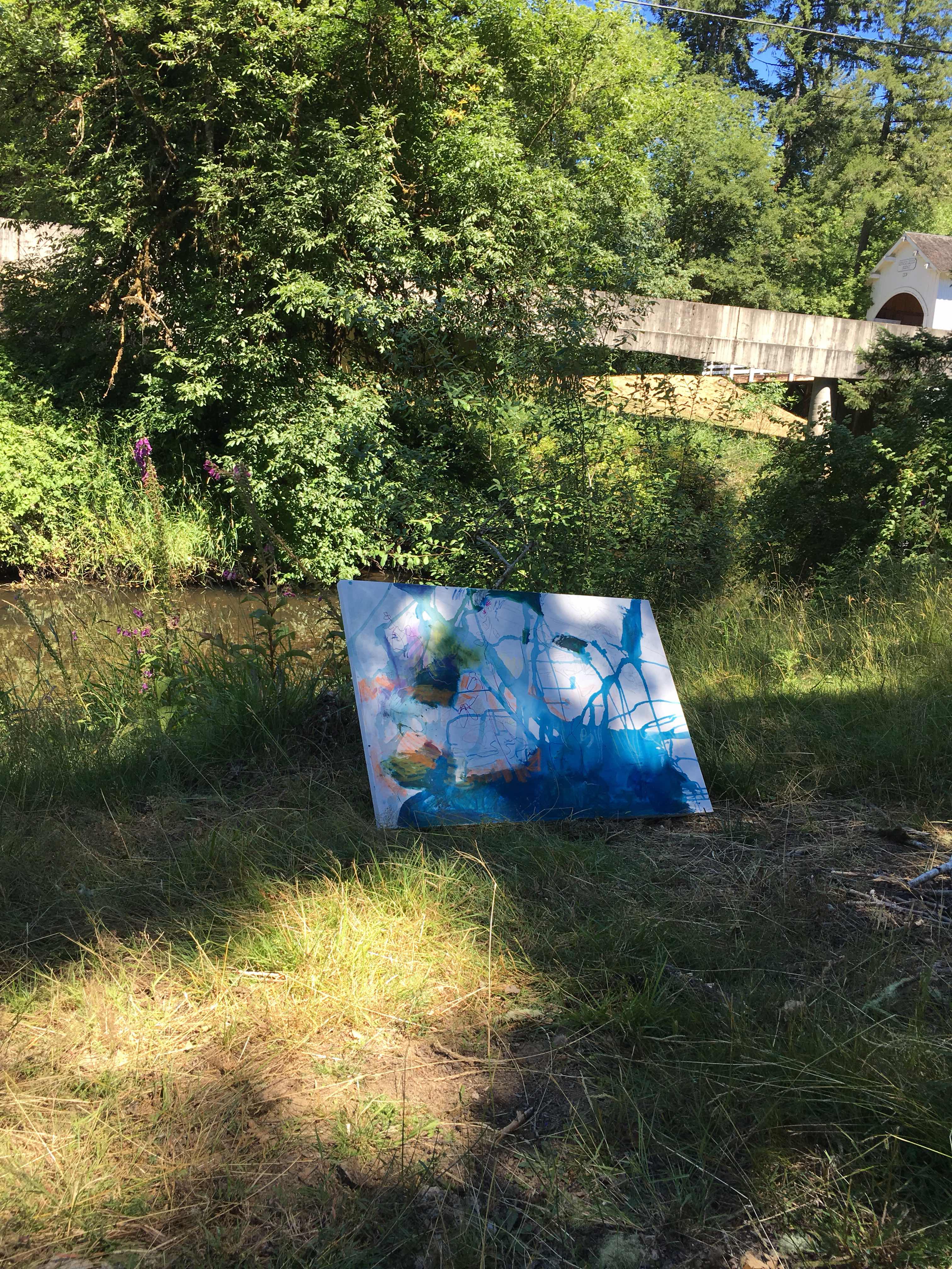
 I cannot begin to make a complete review of the workshop because her quotable pearls of painting wisdom were numerous. The atmosphere so friendly in an ideal size class of 8. Two well mannered dogs, jokingly referred to as the therapy dogs, were one comfort we experienced in Ruth's attic studio in the Oregon City countryside. Here creative permissiveness encouraged fearless exploration.

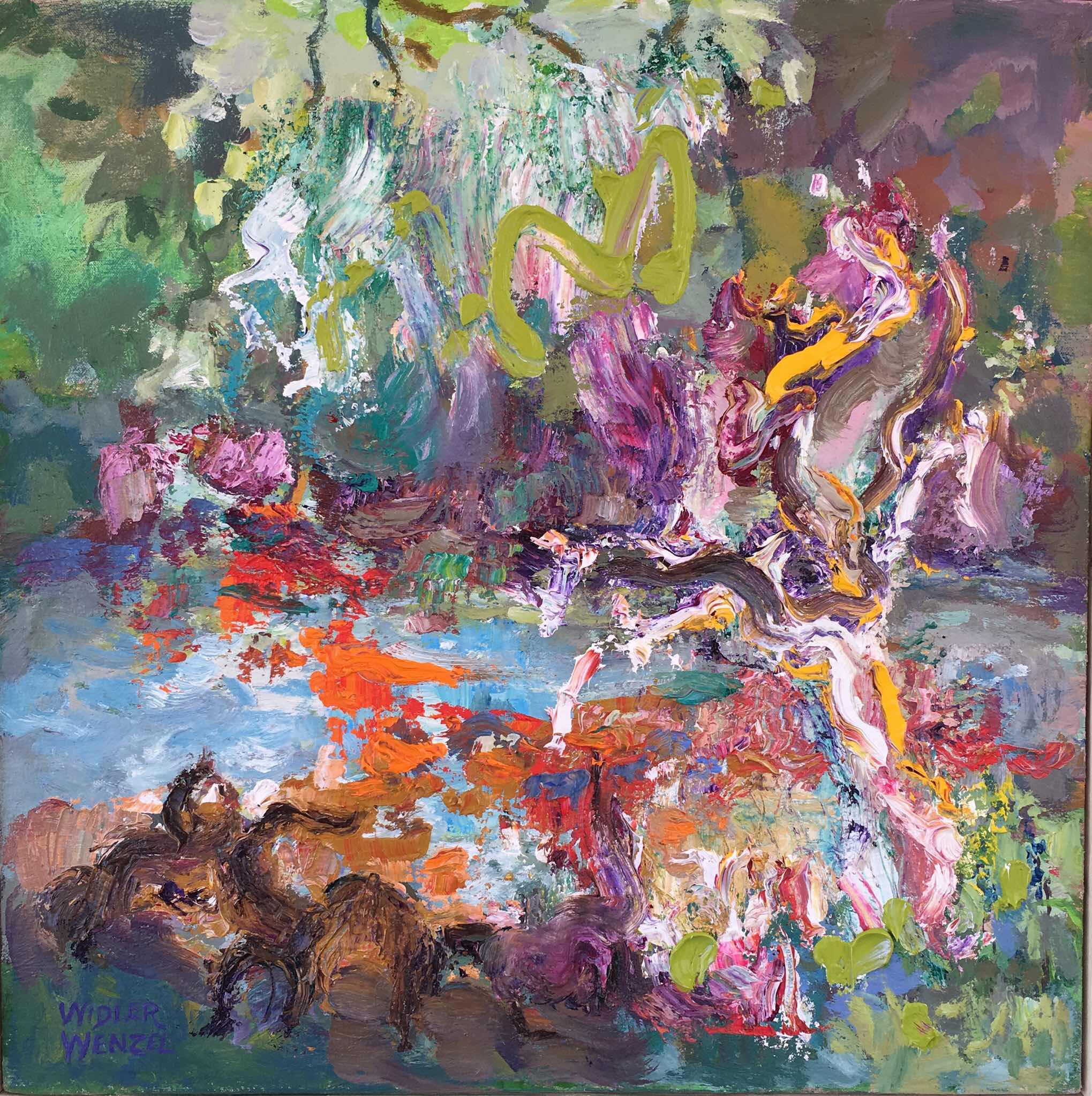
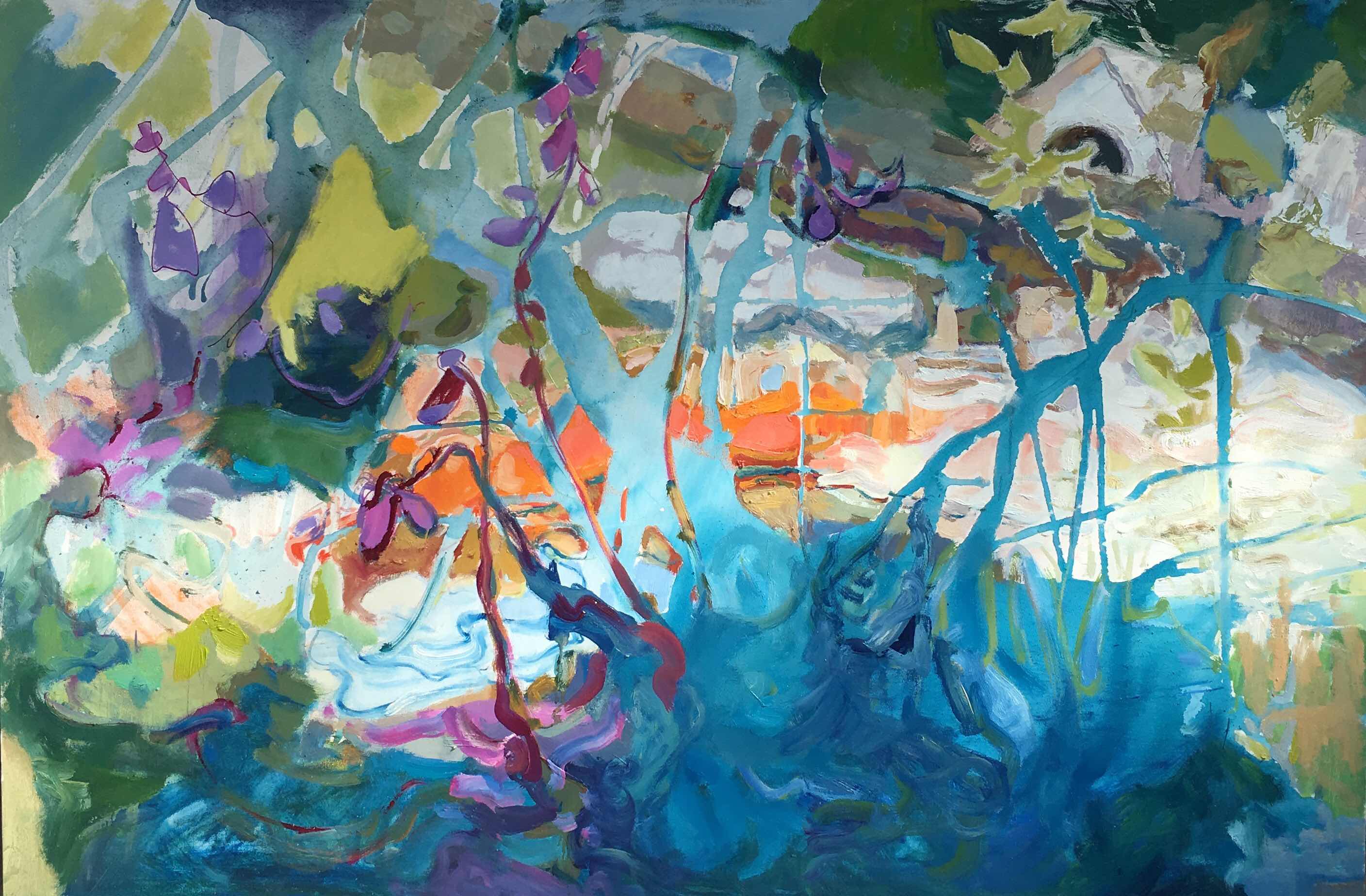
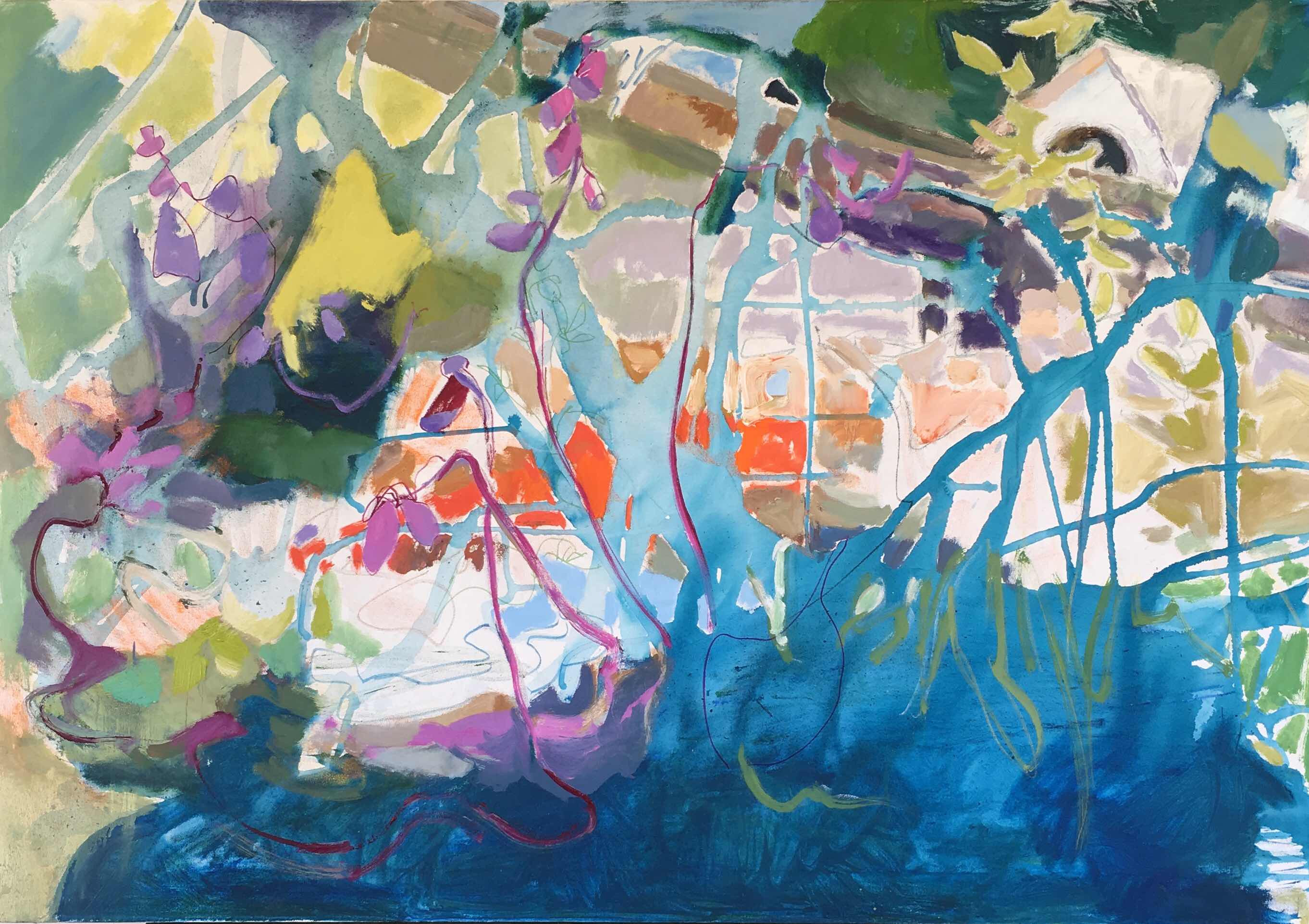
I came to the workshop being dissatisfied with many of my abstracts. I have been oscillating between impressionistic work to almost unrecognizable subjects as far back as I can remember as a child growing up in the San Francisco Bay Area where I was exposed to a local artist working in a cubist style. Recently I have retired from selling my work and concentrating on keeping a limited body of stronger work from all of my periods.  In a limited space, I retire mostly my abstract pieces because they are not as interesting to me.

So here is some of what I took away from Ruth's workshop:

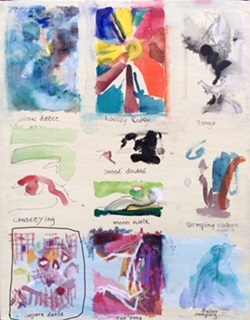
 Ruth on the second day demonstrated her process to color dominate painting. She dressed in interesting complementary colors and she said she pretends she can not fail. She choose nine titles from a list of titles she keeps on her phone. Then she did some small compositional sketches in color for each title. She felt free to attempt the unexpected without being judgmental. Why not express smoke with yellow green? The unexpected is powerful.

 Perhaps if I made lists of  painting titles around a personal subject, my abstract paintings would develop narrative making my connection to them greater resulting in my caring about them even after many years. On the other hand I might be less intuitive. Also my first markings on a painting are the freshest and I could loose that energy by moving from a thumbnail to a larger finished piece. So what it boils down to is starting out on the paintings without preliminary preparation means only a few develop the involvement that stands the test of time. Looking at my favored abstracts they are all connected to a time where I had a heightened emotional occurrence. I like them not just because of a sentimental remembrance but I performed better at the creation of the piece from whatever I was experiencing at the time.

 I  do not have failed abstracts just unfinished pieces and more frustration than I want in the future or need to create for myself. I shall try a modification of her method for a short time and see what happens.

 Back to Ruth's demonstration : For her finished demonstration piece she chose from the nine spontaneous renderings she did of her titles.  While painting her piece, she focused on the subject helping her to keep her Judge away so she could continue feeling free to play.  Only later if the painting isn't working does she refer to applying her list of principles of design.

Another trick to prevent tighten up is to talk to her Judge. She says," Inner Judge, I don't want to hear you say this is crap because you interfere with the fun, spontaneity, and creative surprise." Then if that doesn't work she says " So you are still here judge, time for me to take a break."

Before the workshop sometimes when a painting was not going well I felt frustrated thinking the painting was getting crappy, I didn't take breaks.I would become frenzied trying to prove to me that my Judge was wrong and my whole feeling of self worth depended on being able to prove that I could paint. Regrettable results usually developed! It is also  not always enough to stop one piece and start another.  I need to become more self aware of when I am responding to the counter-productive Judge.  Talking to my Judge would mean I recognize the Judge and automatically I hope I will reset my thinking and mood.

  Ruth gave additional tools to arm me against the detrimental Judge in my mind but I  will not go into them here.  I think I have made the point on how I am processing and I am eager to get back to painting.

 When Ruth came around to help us, if we needed it, I mentioned that only a few of my abstracts that are far from representational survive the test of  time. I would have more success if I follow your process. To which she responded with doubt.  I believe I am not a narrative painter and  years ago more intuitive than now.  Part of me says I should continue to trust reacting to the canvas activated by a few random marks. Yet the promising thing about Ruth's process is that refusing to listen to your inner Judge does open the door to intuitive choices.

Ruth said she is not intuitive but I disagree. She is an intuitive painter balanced by moderation. She only refers to the academic elements of design when the painting doesn't seem right.


The third day Ruth did a demonstration focusing on line.
Dressing for success, Ruth wore an outfit with  subdued black and white  Which drew my first impression to the variety of linear patterns in her clothing.

Before Ruth's workshop I disliked pulling myself away from painting to shop for clothes. I wanted to spend money on art supplies rather then clothes. Now I hope I will enjoy clothes shopping more when I search for clothes that will express the kind of paintings I want to make.

 I once commissioned a felted scarf  by Patricia Berman who fashioned it in response to one of my playful collages. Now I have a reason to allow myself such a luxury in the future.

Before the workshop I had a dim view of sitting while painting. But after seeing the results of the other students, I want to try sitting for smaller brush movements where edges of shapes are expressive  and standing while painting bigger movements.

The closest thing to journaling is Ruth's lists of subjects, but I was reminded of  20 years ago at a WSO meeting where Donna Watson, and Ruth talked about the importance of journaling in their painting  metamorphose.So I will journal and make lists. Some will be subjects I would be happy to share.can share. If there is interest  a future blog could be my journal on how inspired I am by the students comments and the work they did.  Of course I will share my work during and after the workshop next Wednesday.