Comments, relating to the topic, are welcome, add a great deal to a blog, but must be in English, with no profanity, hate-filled insults, or links (unless pre-approved) To contact me with questions: rainnnn7@hotmail.com.


Showing posts with label composition. Show all posts

Wednesday, August 28, 2019

by Diane, Overcoming painter's block recipe - benefits and shortcommings

Starting July 31st my past four Wednesday blogs were about the development of two similar paintings.

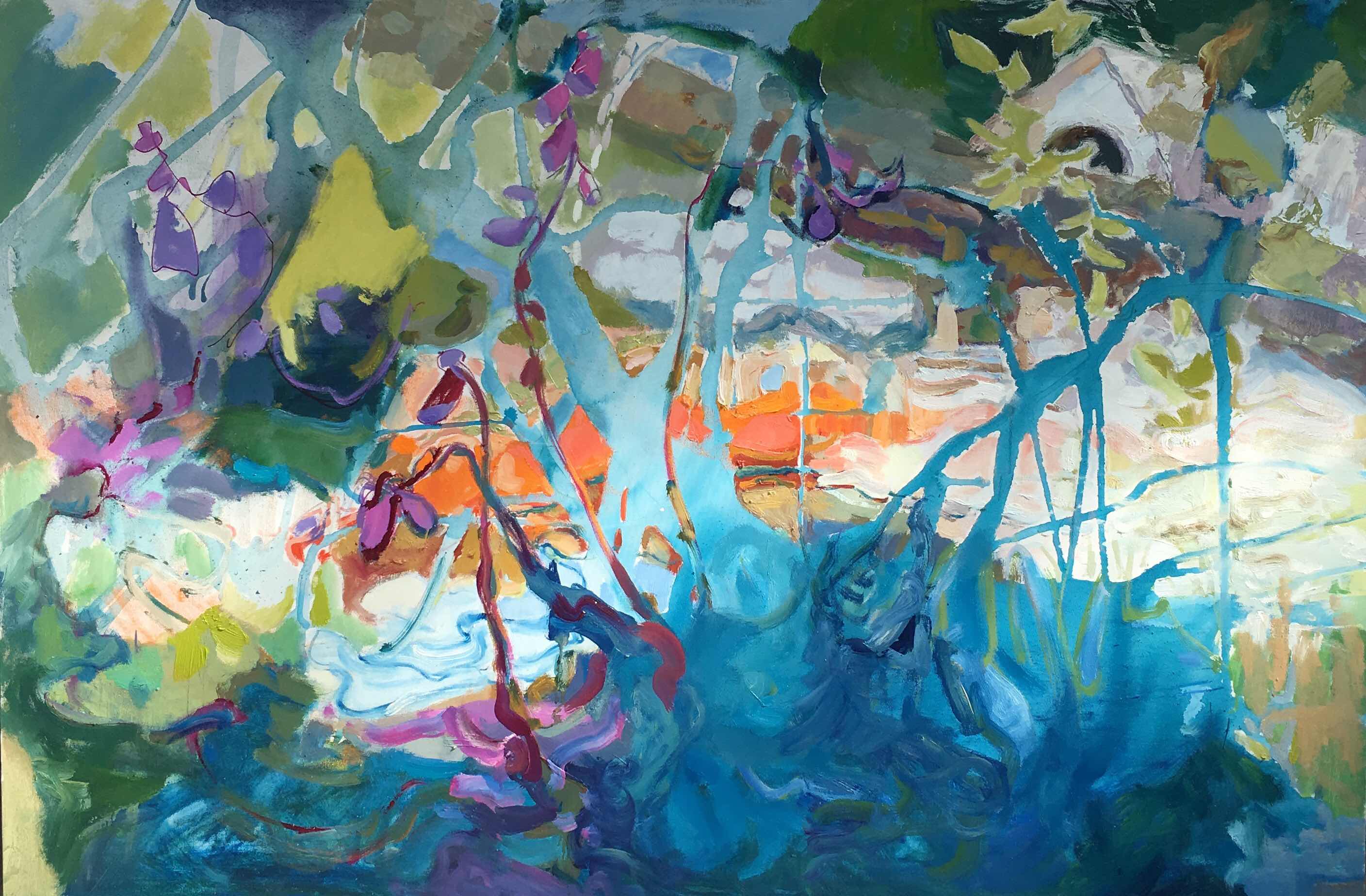
I declare them finished this week.  At least for the foreseeable future!  Their titles might be  MY DREAM #1 and #2. The  recipe for these combined three entities - our garden, a painting surface already covered with textured paint.  Henri Rousseau's painting, THE DREAM was an interesting start because I enjoyed the lush forest.

The first painting has more of Rousseau's symbolism that led me to see changes in meanings of symbolism between 1910 and today. Also needed a larger surface. In the second painting.  DREAM #2  became more personal with symbolism from  life closer to my home garden.

One of  the personal symbols was my husband Don's and my sculpture of Nessie.  I wanted to commemorate my wild garden that we both created but will be replaced by easier to maintain plants in a drier climate.


 Another entity in my formula is the surface. DREAM #2 was painted on top of an incomplete abstract became the surface. I borrowed much of the original abstract for the overall coloring of the painting.


 This week I attempted to resolve MY DREAM.


Mine symbolizes mystery and female renewed, creative flow.

Rousseau's has female symbolism of renewal, peace plus esoteric mystery.

Some of the subjects are shared and  may have different symbolism.
Mermaid by our front door

 Summation of the benefits and critic of my experimental recipe to banish painter's block


This new adventure followed a dry spell when the sightings of foxes abruptly terminated my last series of immediate reactions to what I was seeing of them.  Hopefully the foxes went closer to the river where their pray wouldn't be warned by the snapping of dry grass. As we saw fewer and fewer fox we worried that the mountain lion sighted in our neighborhood took them.

Writing was a positive part of my process keeping me thinking, photographing, and researching origins and symbolism of plants and animals. Writing about the experience, I want to add in retrospect, was as important as the three entities in the formula to overcome painter's block. A fifth entity is a strategy of determining when the painting is finished.

 If  the summer had not dried up the garden plants,  if the yellow jackets did not pester me, if I wasn't about to pack for travel, I would have been tempted to add some birds, and define the pears and peaches, or add surreal Koi fish flying about.  Adding more was becoming work instead of fun. So my final hours of painting was devoted to looking at the abstract composition of color values, compositional contrast to bring some flowers and the snake to more dominance. I made the background darker and more purple to help to make the moon more noticeable.

I am happy with the painting.  Thank you Rain for making me a co-author here.
Stay tuned. In October I foresee another need for a painter's block formula. Painter's block often occurs after life's interruptions.


Wednesday, March 20, 2019

Diane Widler Wenzel: Changes to oil painting started with linear marks


More balanced!  More depth! Feels much improved after reviewing my collection of on location gestural sketches described in yesterday's post.

Wednesday, August 15, 2018

Photographic aids for establishing a point of view for painting


These pictures were taken with my I phone holding it way above my eye level in the one with sunflowers and sprinkler.


I held the camera below my eye level to take the selfie of me in the blackberries.


The camera lens finder or binoculars are tools useful for inspiration to paint.. When painting on location I have used both to help me select from too many stimulating subjects outdoors.  These four photographs are examples of taking a pictures with the camera tilted  upwards like the point of view of a child. I like to keep  the innocent child-like excitement in my painting and the perspective has something to do with the drama and charm in my painting.

Wednesday, July 25, 2018

Resolving Ritner Creek painting; my stategy to keep the life energy of my first impression

24" x 16"


40"x 60"


My 1960 abstract had dominate blue lines in front of firey color similar to my Ritner Creek painting.                   


Early in developing Ritner Creek painting I enjoyed a journey without a formula or procedure other than working all over the surface. Mostly invented with happy abandon, I proceeded. But as I neared covering all 40 by 60 inches, I was unsure of my final steps. Usually I would sketch linear diagrams. I didn't need to because I remembered I had painted a picture with some similarities.

I had been working with little self-critiquing between 8:00 AM and 10:00 AM for several weeks little by little the abstract took on color, texture and recognizable subjects. I dabbed paint in the spaces between the existing blue lines.  I was avoiding tightening up as I worked within the boundaries of the lines by dabbing the paint and not exactly filling the shape.

Stiff, forced shapes and line are lifeless.  In comparison to the rough shapes that were intended to be behind the branches the blue shrubbery started looked stiff so I applied thicker paint over the acrylic faster and faster with little attention to staying within the line. The blue paint overlapped the background on purpose. The paint was thicker than most of the background increasing the impression that the cool blues were in front of the warm oranges.

Both the early abstract and Ritner Creek paintings contain features from nature. The abstract has cloud shapes and warm colors like fire. Unlike the early abstract the Ritner Creek has recognizeable nature and architecture arranged  in a natural sequence of foreground, middle ground and background as seen in nature. Drawn perspective became important. In this painting I made a concession to realism marking symbolic lines of the path of the water. A realistic stream requires suggestions of where the river bank is.

Time to judge how busy I want the painting to be. Time to compare the lines with those in an older painting. All the existing lines are put in question. I wondered how much movement and how fast the movements can be and still have a the painting comfortable from a viewing distance within my home. Did the lines that formed acute angles look like the branch was broken? Did I want to create the impression that the hotter than usual July was devastating?  No!

I wanted an aging, stressed landscape that was beautifully striving to adjust and live.
The lines in my early abstract are controlled, sure and fresh. In the Ritner Creek painting the lines change direction and crisscross. These lines express another feeling and another narrative. I reviewed my initial intention on location.

Keeping my first impression from painting at Ritner Creek: 

Under the shadows of the huge oak trees a cool tangle of blue flora symbolically opposed the warm shallow water. I felt energized, young and awed. Not broken! So the zigzag forest green line had to go. Large color zones were joined to simplify and slow down the linear speed.

Another technical challenge has presented itself as I lightened some of the darks here and there dispersed throughout the painting attempting to simplify the color areas, the whites became more like pastel colors. Perhaps I should say tints instead of pastels. Pastel painting is now recognized as being equal to watercolor, acrylic and oil painting.

Yesterday, I felt some background areas were too precious to paint over them with more blue shrubbery. I turned the painting upside down and painted more thriving life into branches with curves more like my early abstract painting. Also shortened one vertical twig adding three other vertical twigs because vertical lines slow down the movement making it more comfortable for viewing in my small house.

The painting is not perfect. Small imperfections are life giving. I am calling it finished for now. I can't wait until the oil is dry enough to hang the painting up inside the house, then live with it until I see if it creates Ritner Creek atmosphere. I fear when I bring the painting indoors that the colors will look much darker. Also will the rough brush strokes be too busy for close viewing. Such are the questions I have as I consider cataract surgery. Maybe after surgery dark colors will be more vivid indoors. Or maybe cataracts are a bonus to my creative impressions.

Midway
Finished, maybe


Wednesday, May 23, 2018

Paintings that get a little remodeling

From time to time I like to go through my old work especially when I need to consolidate to make room for new work.

 I cropped the late evening coastal painting started at Yachats about ten years ago and it was exhibited at the Albany Public Library in 2014. Now it looked like it would be stronger with an additional cool gray wash over the sky to simplify the value composition to further pop the reflective white foam.


Rocky Creek Wayside was painted six years ago. Like the  evening Yachats painting the foreground dark value rocks were many values and is now stronger after washes reduced the contrast from very dark to light. The composition is stronger width the foreground rocks ranging in value from very dark to medium dark gradually transitioning to lighter rocks in front.


The canyon just above the confluence of the Salmon River into the Snake River painted in the mid 1990's. Since then I have added magenta and opera paint. The opera made the thalo blue green shade in the sky strident. A wash of alizarin crimson  achieved more harmony.


 In 2007 Arizona  watercolor was started and later the black ink drawing was added in 2013.  This time additional white acrylic ink pened in with the goal of creating more flow of movement.


Oceanside, California 1998 finished several times. The white acrylic applied with a brush brought the jewel like sparkle back while adding flow.  Also the green watercolor mixed some with the white.

Overworking these paintings was avoided by storing them out of sight for years.  Even storing them for a month is a big help. Then when looking with fresh eyes,  I see more easily compositional considerations of the whole painting was the goal of the changes. I could verbalize the reason behind the changes.

Wednesday, May 09, 2018

In studio verses outdoor painting


Above is an early stage of the painting. I was painting the last days of our birch tree that was rotten and had to be cut down. I liked the transparencies of the watercolors with gloss medium to make them permanent. The painting I did from my studio window didn't have the excitement for me.  I started several more of the tree outdoors.


The next day painting outdoors, the elements of breeze and sun made a great difference in feeling the energy. Why? Was it because I needed to be more direct, spontaneous and fresh? I favor the paintings that happen outdoors maybe because I feel the pressure of the elements.  I must say the most important things from the first stroke of paint.  I get right to the essence of a primal experience.


In this photo the yellow is brighter than in the original.

 I started it the day before the tree was fallen and completed it as the arborists cut down the tree. The spring light  makes my paint appear brighter outdoors. When going back indoors to view the painting, the colors are often too dark.I had to go back and forth viewing the painting in both locations and making adjustments because it was intended to be seen indoors.
The tendancy for me is to make my outdoor paintings too dark. The darkness is partly caused by acrylic paint darkens hours after first painted. As I paint outdoors more as spring becomes summer I adapt my paint to be lighter than what I see outdoors. On this series the next I painted over the dark colors.


In the above painting rubbing alcohol lightened darks.  Another method  to brighten the rhododendrons was adding layers of whites.

In this series I found working indoors more comfortable even with the complex process of using dilute gloss medium. After working some paintings outdoors, I came back to the indoor painting. I did negative painting with complimentary blues behind the branches. The rhododendron flowers matured. Pink leaves poked between blossoms. The birch leaves glistened in the afternoon light and maybe this almost documents the shimmer.

In conclusion: Painting outdoors often has more satisfying end results for me. Also so far the outdoor use of watercolor and dilute gloss medium  doesn't work for me. Painting in acrylic or oil are the best methods outdoors for me. Acrylics can be diluted for transparencies like watercolors so the range of paint qualities. The only reasons I was using watercolor paints with gloss medium was that they would be lighter weight in airplane traveling.  Watercolor with gloss medium does not need to be covered with glass.

Maybe with more experience and modifying my outdoor equipment, I can make the technique workable. Next Wednesday I will also address framing and hanging of the tree series.

Wednesday, March 28, 2018

When is a painting finished?

A painting is never complete. I never set aside a painting  until I can look at it for a long time without it telling me it needs changes.  I never stop painting until it resonates emotionally with the mood of the beholder. Also for story illustrative paintings, they are never satisfying me until they communicate to others.

A neighbor brought back a painting I had originally finished eleven years ago and I had given the neighbors as a wedding gift about ten years ago.  It had darkened hills as though a rain storm was coming. The image of it on their wedding announcement had lighter hills. Apparently I had darkened them to make the yellows stand out  as happy perky survivors. After all this time I could see my last minute changes gave the painting an overall feeling of foreboding.

This is how the painting looks after taking a few minutes to paint over the the mountains and green up the valley. Now the neighbor says the painting is after the rain instead of before the rain.
 
 
The original of the Greenwell beach cabin that I thought was finished in Hawaii seemed incomplete when I looked at it hanging at home.
 
With white lines suggesting back lighting, I popped out the plumeria tree, added definition to child gate on porch,  added some fallen flowers.
The white on the plumeria's branches did not help so I removed most of the white lining and now it is like the original with very small changes.


Of all the on location paintings I did in Hawaii in February the wedding painting was by far the most painted over and over. I had no fear of overworking it. At first I had an uneasy feeling about the wedding but as time went by my feeling was for weddings in general so the painting took on the dreamy atmosphere of hope.

When the  wedding painting was almost complete, but I was not sure, I shared it with the Tuesday Critic Group at the Old World Delhi  in Corvallis.
 I like to hear critics of my new story paintings to make sure people see my story. I received good feed back. The log and sand was ambiguous. The painting had a hole in back of the log - a difficult problem for painters.  To my fellow artists the log looks like ground.  So at home I made the sand lighter to define where the log ended.
 
Before critic
After


 Another painting hanging up on trial is of fan coral. I thought it was finished in January, but it is still in question hanging up in our kitchen/ dining area. Living with it for awhile, I may decide but another way to decide is to put it in a closet for a few months until I can look with a fresh critical eye.
 
 This is how the painting looks now.


This painting was started years ago of an entirely different subject.  North Albany Autumn has become a poetic interpretation of Belize fan coral and fish.
 
My belief is never be afraid to overwork a painting. Working on an exercise is nonsense and an easy excuse for abandoning the work that could transform itself many times.  Paintings are not suppose to be perfect. Paintings do not need to be finished; they are part of an ongoing learning experience.