Comments, relating to the topic, are welcome, add a great deal to a blog, but must be in English, with no profanity, hate-filled insults, or links (unless pre-approved) To contact me with questions: rainnnn7@hotmail.com.


Showing posts with label color. Show all posts

Wednesday, October 23, 2019

by Diane: Brushing up for teaching watercolor workshop

Ten more days for me to get ready for teaching a watercolor workshop Saturday, November 2, at the Oregon State Fish Hatchery and Research Center Fall Creek Art Festival.

This year the workshop will be entirely different in focus from years past. The focus will be on the brush and the marks they make naturally. The marks from a single brush is dependent upon how it is filled with paint or ink, how it is held and moved. The brush marks can be individual to each person. Their desires, skills as well as the paints and surfaces they choose enters into the results. The numerous ways the brush is handled is like a vocabulary is to the writer.

Brushes are advertised as if each brush has a single purpose like liner, blender, mop, round pointed for detail, or long ones for calligraphy. If limited to their advertised label, their full range of natural mark making characteristics are missed. Perhaps the advertising labels are to get more sales. For example, the number 1 liner made by the Princeton Art and British Co. has extraordinary possibilities. When the entire length is rolled in wet fluid watercolor or ink so it  holds its maximum capacity, it is capable of making a line that goes, goes and goes increasingly thin and faint.

 
If the 1/8" wide by 3/4" long liner is swiped sideways along its length it makes shapes.
Many lines close together make textural shapes. These two methods are among many ways to use a single brush type. For me personally, getting to know a brush is a springboard to abstracting the subject as well as revealing a story  of how the painting was made.  Secondly, as I become familiar with a brush, I feel  how it might be expressive of how I feel about a subject.
My fourth painting of "Turkeys in the City" has just a few different
uses of the liner brush other than the usual use of it for the rigging on ships or tree branches. The open spaces between the brush strokes makes it easy for me to make major corrections even as the painting is near completion. I just noticed the heads of the turkeys are too large.
  
 
The third painting of Wild Turkeys in the City was painted with a number 12 round Kolinsky Legend brush made from the tail hairs of Russian mink ( in last week's blog I wrote incorrectly that it was sable.) Because it comes to a point it makes good curved feather-like strokes. Also the large brush makes nice big washes. The signature characteristic of the big Kolinsky brush is the round corners from ample wet color stored in the many hairs in the brush's rounded bowl.
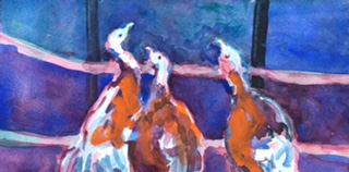


The first turkey painting to the right consists of a build up of layer upon layer of washes using the the 1/2" Simply Simmons 1 stroke plat long . During the process I would put a wash on and then leave it to do some mundane household task, coming back for another wash when the painting was completely dry. I became fond of this synthetic hair brush. In this painting I felt it was forced
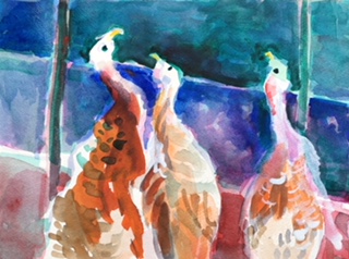

In the second painting of turkeys using the Simply Simmons 1/2 inch flat,  my initial drawing in paint did not go well, so on subsequent layers I was able to draw a new outer edge of the turkeys' heads. The right angle of the brush's tip lent itself to making angular shapes in the drawing and in filling in the background helping to unify the paintings. The lighter early drawing left a nice transition from the very dark background to the very white of the head giving the head a three dimensional form.


Branch with Fruit, Shih T'ao, Ch'ing period
Seeing an exhibit at the  Center Pompidou in Paris inspired my focus for the watercolor  workshop.  side by side were relics from prehistory with abstract works  of 20th century artists.  Prehistory A Modern Enigma reminded me to be mindful of how the marks of tools govern the form of all visual art expression from calligraphy on paper to lettering on stone. From watercolor paintings on paper to silk screen prints.
 The Chinese letter shapes are composed of a number of specially designed brush strokes. The form of alphabets made by the brush are formed in the character of what brushes will do. The letters made by a pen nib and brushes repeated many times take on the different characteristics of the tool that made them. 
Writing with pen or brush also take on the personality of the writer. I want to extend the personal touch to my own painting and inspire students towards their own style in the use of the brush.
 

Wednesday, July 10, 2019

by Diane: Painting foxes


Completed on Day Four
Fox were in the back yard close up for observation until July 5th. The fireworks must have made them fearful to come too close.  We still see the two young ones playing tag.
 Fox move fast. I watch them often. But when working largely from memory, my eyes are on my painting and I look little at the landscape. My husband Don alerts me when any wildlife is in our view. I remember their movement more than their features. I love their perky gait and their grace. Defining their form and movement requires working both their contour and the background as one.
 
Don said he did not understand their orientation. That is okay. The one in the lower foreground I am looking from below. In the middle ground I am looking down.
 
Mornings are so pleasant. Don is watching the ever changing landscape. We are so fortunate to have this view.
 
 The fox the other morning were crying out their warning call when a very big lighter animal appeared running towards us on the road. When it was closer we understood the high pitched bark of the fox. It was not another fox but a coyote.
 

Day 0ne
It took me several days to paint the fox. This 8"x10" oil on canvas board. At first they did not relate to each other. Don said they looked like deer.
Day Two

 
Another painting in which the barn and fields were painted first.  Then the foxes came through and I decided my painting was a stage.  They were begging to be painted.
 

Wednesday, December 05, 2018

by Diane Widler Wenzel: Painting color and texture after cataract surgery

Every Spring the first time painting outdoors after becoming accustomed to dimmer lighting of winter, I need to be mindful that the brighter outdoor lighting makes my paint colors appear lighter outdoors. Then looking at them indoors the colors are much too dark. Since the colors appear lighter, I paint too dark. Soon I become accustomed to painting in outdoor lighting.
Having cataracts removed is like painting every Spring. I am adjusting happily.
I feel grateful for seeing a cleaner brighter view of earlier color in my paintings.

Before

I, also, am aware without cataracts I am seeing like the Spring time outdoor painting phenomenon - I am apt to paint darker and dirtier.  Being aware I am sure I will adjust and be better off seeing truer color.  How fun to see how they relate to one another.
 
After
After surgery for a right eye focal point at three feet at arms length for best seeing my paintings, a big surprise was seeing clearly the textures of paint I had missed and did not know I was missing.


Detail from a textural painting completed 2016
Still wondering how my left eye focus at six feet will integrate with the right eye focus at three. Second surgery was yesterday. Such a big experiment!
 

Wednesday, November 14, 2018

Painting after cataract surgery

The removal of cataracts is rejuvenating my vision and I enjoy more beautiful, bright vibrant colors. 
The future holds some welcomed challenges. One challenge is painting color expressive in new ways to me.
At the Oregon Fall Creek Fish Hatchery and Research Center's Art Festival, Saturday, November 3rd several days after the surgery I demonstrated painting process. During the lunch break I went outside to watch a pair of spawning Chinook. I did a quick sketch on my watercolor paper. 


Then inside I began the watercolor. Even in the early stages, I started painting dark that soon covered too much of the painting. One reason may be that color now looks lighter with my cataract free eye.

 
Working from memory at home the painting lost the flow for me. So I washed most of the paint off  by dunking it in our bath tub then sprayed away the color with warm water. Working over the washed painting, I started wishing the Chinook covered more of the painting surface.  The finished piece needed cropping.


I find many happy surprises looking at my paintings done before the surgery. But some tempt me to change them. It would be a good idea to wait on changing work until I get used to the way the world looks now. But on an acrylic painting, "The Painter at  the Beach", the color just does not match the emotions I want to portray, so I decide to touch up a few places.


The purple on the sky popped and looked too saccharine.  As usual I deceived myself thinking only a few brush strokes would make this painting better express how it felt outdoors that Autumn day on the Oregon Coast.
 
I never learn that going back into small areas usually means the surface becomes a mess of strokes showing awkward indecision   Somehow the grays of some clouds had nice line but were dark and foreboding. So I needed to wipe it all off.  I summonsed my courage to be more direct. I made most of the sky a thin wet tint and brushed strokes of grays close to how dark they appear.

I started a new painting as a test because I feel uncertain of using a new surface until I learn how my eyes work. So a $7.00 Habitat for Humanity 54" x 42" lightly used canvas is a bargain giving me freedom to paint freely.  On top of this discarded painting I am responding to what is on the canvas. The all over random criss-cross heavy broad stroke texture and pastel palette allowed my addition of  an imaginary powder blue sky.  Then I had the freedom to further assign vertical whites to reach high. The title in marking pen was on the back - "Another Spring". It is still "Another Spring".


Struggling is good in the painting process for several reasons. One, the positive outcome of a struggle means I appreciate all the more the success at learning. Two, I always anticipate that there is more to learn.


Wednesday, November 07, 2018

by Diane Widler Wenzel, My colors seen through different lenses

 
           I anticipated lavender areas would help pop autumn colors to express how I felt about Ritner Creek.  I began the painting on a prepared ground of lavender with a band of blue tint grayed with burnt sienna at the top. Before my surgery I was unaware that the lavender I was painting was so saturated. It looked almost gray to me like the photo shopped one below.


October 30th I had cataract surgery on my right eye.
The second  is close to what I now see with my new artificial lens.
 
 I like both ways of seeing my painting. But I feel it was more cohesive through my quinacridone gold colored cataract often referred to as being amber colored cataracts. The yellow ting grays violet and darkens navy blue and browns the greens for me.

Just goes to show how we perceive the world depends on the lens with which we view it. We do not sense the actual object through our eyes. We see the color not absorbed by the object. We see energy reflected by the object and how the energy flows through the lens in our eye and is channeled to the brain.

Thus an analogy is drawn between perception of colors and our perception of other aspects of life. I am aware of my lens on politics tending to bend information towards what I want to believe and the structural beliefs of my lens will not focus on information that does not affirm what I want to see.

Our preferences depend on familiarity: Over past decades the desire for saturated colors has increased a demand for more colorful greeting cards due to the public getting used to TV screen colors. Our figurative lens through familiarity not only finds saturated color more acceptable, we buy more saturated color items.

In 2018 more family and friends are looking at my abstracts than they use to.  Thirty years ago I used to watch gallery visitors walk right by my work. Now people look until the colors and textures affect them - calming them, or energizing them, or striking other emotional connections. In the last ten years or so more people are used to seeing abstract work and the vibrantly colors on their electronic devises. Face book plays a part in getting the general public seeing things in intensified color hues, resulting in a preference for brighter colors. In addition to accepting modified colors more people are able to connect with the abstract.

Equally abstract paintings in 1959 went unnoticed or loudly condemned by many, even by artists. Human nature rejects the different and strange.  The viewer were more easily gratified by instantly recognizable objects.

In 1959  the Portland, Oregonians' were angered by Louis Bunces' abstract mural for the Portland Airport. It was hotly debated. The opposition wanted a pastoral scene. His mural still graces a wall on the way to the concourses. He pioneered the public display of the abstract and his work continues to familiarize us with a broader appreciation.

I am tempted to go back and change some of my paintings with lavendar and greens and yellows. The red ones have not changed as much. But maybe in time I will get familiar with the new way I see colors and I will accept the old paintings as they are.

Wednesday, September 12, 2018

Easy to mix paint on glass palette smorgasbord makes my day


 I got frustrated with the confines of a lasagna pan palette with parchment paper inserted with masking tape that wouldn't stick.  Every time I needed a new color, I squeezed a little from very old hard or messy tubes with caps encrusted with dried oil color. Yikes what a mess I had until I squeezed the tubes until they were completely rolled up. Some brands the neck of the tube pulls apart to release a blob of paint. My lasagna pan was so full there was no space to mix.

With no idea of which painting I would work on today, I put a 22" x 28"  glass on our dining room table.
Even without a painting plan I just transferred some cobalt blue and started mixing in white making  four values I did the same with thalo blue.


Then added alizarin crimson to the cobalt blue and yellow ocher and a few other colors. Painting indoors because the air quality from forest fires was bad, I used walnut oil, no solvents, and palette knives. Started painting with the bright salmon square. Abstraction of landscape came to mind so made off whites near the top and dark values near the bottom. The palette knife lent itself to rectangles and I saw basalt and trickles of water.


At the end of the day, I decided I had been working under a big handicap. I've got to improve my palette for working outdoors. A cookie baking tin?

Wednesday, May 09, 2018

In studio verses outdoor painting


Above is an early stage of the painting. I was painting the last days of our birch tree that was rotten and had to be cut down. I liked the transparencies of the watercolors with gloss medium to make them permanent. The painting I did from my studio window didn't have the excitement for me.  I started several more of the tree outdoors.


The next day painting outdoors, the elements of breeze and sun made a great difference in feeling the energy. Why? Was it because I needed to be more direct, spontaneous and fresh? I favor the paintings that happen outdoors maybe because I feel the pressure of the elements.  I must say the most important things from the first stroke of paint.  I get right to the essence of a primal experience.


In this photo the yellow is brighter than in the original.

 I started it the day before the tree was fallen and completed it as the arborists cut down the tree. The spring light  makes my paint appear brighter outdoors. When going back indoors to view the painting, the colors are often too dark.I had to go back and forth viewing the painting in both locations and making adjustments because it was intended to be seen indoors.
The tendancy for me is to make my outdoor paintings too dark. The darkness is partly caused by acrylic paint darkens hours after first painted. As I paint outdoors more as spring becomes summer I adapt my paint to be lighter than what I see outdoors. On this series the next I painted over the dark colors.


In the above painting rubbing alcohol lightened darks.  Another method  to brighten the rhododendrons was adding layers of whites.

In this series I found working indoors more comfortable even with the complex process of using dilute gloss medium. After working some paintings outdoors, I came back to the indoor painting. I did negative painting with complimentary blues behind the branches. The rhododendron flowers matured. Pink leaves poked between blossoms. The birch leaves glistened in the afternoon light and maybe this almost documents the shimmer.

In conclusion: Painting outdoors often has more satisfying end results for me. Also so far the outdoor use of watercolor and dilute gloss medium  doesn't work for me. Painting in acrylic or oil are the best methods outdoors for me. Acrylics can be diluted for transparencies like watercolors so the range of paint qualities. The only reasons I was using watercolor paints with gloss medium was that they would be lighter weight in airplane traveling.  Watercolor with gloss medium does not need to be covered with glass.

Maybe with more experience and modifying my outdoor equipment, I can make the technique workable. Next Wednesday I will also address framing and hanging of the tree series.

Friday, April 13, 2018

Andries Fourie's criteria of selecting works for the 2018 "Around Oregon Annual"

I am very enthusiastic with the well said statement of the "Juror's Statement, Andries Fourie, Around Oregon Annual 2018.


 To me these criteria embrace opposites that are like reminders of meaningful directions. These remind me of my instructors at Portland State University. Like Frederic Littman who showed the marks of his knife  drawing onon the surface of his sculptures harkening back to the many preparatory drawings he did.


Also Frederick Heidel in his watercolor paintings put down general washes then he left tentative markings  before adding another wash and finaly  drew  his confident emphatic lines . This process reveals his journey towards resolution. His work is rooted in his vision of his garden  and figures with mysterious stories that engage the viewer in the process of their own imaginings of a story.

Andries Fourie's criteria also remind me of Katharine Kuh, the art editor of the "Saturday Review" during the 70's.  She said what makes a painting of nature great art to her is when the image changes the way she sees nature.  So when she sees a tree, she sees it like it was painted.
 
These are ideas I can use in looking at my own process and where it is going. Andries Fourie said:

I feel truly fortunate to be able to spend my days looking at, writing about, and making art. Every time I look at a work of art it allows me to see the world through someone else’s eyes.  When a work of art holds my attention I lose my sense of self and feel, even if only for a moment, immersed in the experience of another person. I am thankful to all the artists who submitted work, and gave me the opportunity to see the world through the lens of their temperaments and experience.
 
One of the reasons we value art is that it serves so many purposes.  It can examine the idea of beauty, explore the nature of perception, communicate ideas or emotions, or even evoke pleasure.  Art is a house with a thousand doors.
 
That said, a juror is tasked with selecting a small number of works from a large pool of submissions, and in doing so, each juror employs a set of fairly individual criteria.  My own criteria for selection were roughly as follows:
 
I am interested in art that is more than just an image or an object, but rather serves as a catalyst for an experience.  I am less interested in work that is academic or was executed purely as an exercise, and more interested in work that seems to me fully formed, complete and resolved.
 
I am drawn to works of art that create their own consistent and convincing logic or reality.  I value originality and a distinct perspective.  I am attracted to work that is almost immersive in nature.
 
I respect craftsmanship, technical facility and mastery of design, but feel that they are most effective when used in much the same way a writer uses grammar: to tell stories and relate experiences.  When it comes to form and meaning, I want to have my cake and eat it too. 
 
I prize confidence just as much as doubt, and emphatic gestures as much as tentative ones.  I love clarity as much as ambiguity.  I am impressed by work that shows me something in a new way, or from a new perspective.  I am as impressed by spontaneity and the beauty of an accidental gesture as I am by the simple clarity of structure and intentionality.
 
I want to be challenged and seduced by forms, textures and colors.  Sometimes I appreciate work that stumps of baffles me, and forces me to unravel the maker’s strands of thought.  I believe ideas can be as elegant as textures or colors.
 
I value persistence and consistency.  Nothing makes me happier than to see an artist pursue and elusive idea, skill or visual effect doggedly and thoroughly.  It gladdens my heart to see work that shows evidence of having consumed and absorbed its maker.  I love to see the residue of struggle and joy in a work. I am inevitably impressed by art that bears in its form evidence of the nature of its birth.
 
I will be very interested to see the "Around Oregon Annual 2018" June 1 -July 13 with a reception June 7, 5:30 -7:30 with a brown bag art talk June 14,  noon -1:00 pm at The Corvallis Arts Center

Wednesday, January 31, 2018

Rethinking acrylic painting after inspirations from snorkeling at Turneffe Flats Atoll

Before my trip to Turneffe Flats my first  plan was to paint a sky with great depth. Then I thought an abstract direction. Taking on a completely new direction because I loved the texture of a hand prepared canvas.the painting would be about paint and fabric. Then I thought this could be an underwater scene with a ray swimming.

After returning and seeing a number of rays swimming gracefully, This jagged swim line for the ray is wrong. I thought of Duchamp's nude descending a stircase. I then rejected the angularity of cubism. In Belize I was more fascinated by bubbles rising from snorkels and how they wiggled and reflected a calidascope of the surrounding colors.

Photographs do not show the movement over time like my perception.


When I painted the bubbles rising to the surface. The surface is darker in this painting. If I am going to be accurate about my memory of the surface plane, it would be lighter and more broken up reflecting colors of the sandy bottom. It occured to me that I could turn the painting upside down. Or I could  put more swaths of sky blue and smaller swaths of the warm tones at the sandy floor.


Wednesday, January 24, 2018

Tropical waters inspired abstracts in process


Coral reef colors first, then water movement followed by pattern and texture are the inspiring memories I brought home and were foremost in my mind.  As I started to paint, I took into account the materials I had to express my delight.  Watercolor was my painting medium of choice to express the beauty of light in the pristine waters of the reef that I saw snorkeling at Turneffe Flats Atoll.

First came the juicy somewhat rectangular colors. Then I added pencil and crayon drawings of repetitive patterns. During this process I marveled at the juxtaposition of randomness and structured organized life in the reef. Painting extended the joys of the vacation.

I saw two compositions  as my painting /collage evolved. So I turned the board and cut it in half.  I wasted only a small piece of board so my pictures would fit in the frame.  The lavender fan being a collage piece could be moved around until I found a sweet spot.


Collage of my handmade papers and purchased paper
 over watercolor
Watercolor, mixed media and collage


I love underwater photographs of the reef but I also like the emotional involvement of abstracting from my memories because these paintings express my internal reality.  These collages remind me of small details I focused on while snorkeling. Also the feeling of water movement gently swaying me this way and that.  Some tall sponges and corals reminded me of  human anatomy like our fingers. In previous landscapes I found the shapes of the hand and fingers like in the basalt columns of Coyote Rock, on the Siletz River in Oregon.


Wednesday, January 17, 2018

Beginning to paint after being away


When ever I am away, it is hard to get back into painting again. Even though I did an accordion book using half pan watercolors at Turneffe Flats, these small 16 pages that I previously posted left me without a flow.  When I got home I declared the book finished.  I didn't get back to painting until about 10 days later.
So to start, I decided to get out my tube watercolor paints and see what my colors would do in reminding me of the colors at Turneffe Flats. The white of the paper make watercolors so sparkling like the colors at Turneffe Atoll.

Wednesday, December 06, 2017

Admiring Edward Hooper's Moodiness Created Through Composition


"Lewis Barn", 1931, a watercolor by American artist Edward Hooper can be analyzed as to how he created the mood.
        Is the main subject the barn with the dark side facing left but the roof points the eye upward?  The upward movement doesn't uplift my spirit.  The dark lines and areas behind zigzag me back to the unseen back of the barn.  From the the wide dark band does your eye skip through the barn to the small window? When do you see the dark fence posts pointing  the eye toward the small square window,  plus the dark earth zigzagging toward the base of the front of the barn underlining the window? The fence posts might be seen secondarly.  The small static square window sets a mood of forlorned mystery for me.  Does your eye continue to circle in a figure eight or does it stop at the window?


Below is a later1955 painting, "South Carolina Morning." Is the main subject the woman in red or the woman grouping with the doorway? She stands out by color hue of red against white and not so much from the color values of darks and lights. The mystery is why she is standing in a doorway. The emptiness of the blue sky and light ground draws me into her.

(The pictures by Hooper are taken from the book, Silent Places, A Tribute to Edward Hooper, Fiction Collected and Introduced by Gail Levin)

What I admire is every part of his paintings is essential for creating the mood and mystery with no distracting extra information in the negative spaces. Hooper has no fear of cutting the composition with a horizontal right in the middle of the painting pointing to the main focal point. It is no wonder he is widely admired.