
Last Wednesday's blog was my lesson plan for a November 4 class at ODFW Fish Hatchery and Research Center. I explained one approach selected from many ways to watercolor paint.
In Summary: Consider beginning by choosing what object or living thing is most important. Decide what size it will be in relation to the entire surface area. Decide where it will be on the paper. Be mindful that the surrounding shape helps to make the painting expressive.

Lesson on technique of putting down watercolor paint on paper: Once you have a rough idea of size and placement of the most important thing, make an outline of the subject with wet watercolors. While the puddle in the line is wet, load the brush with a little more paint. Touching the wet line with the loaded brush pull the paint outward to the edges of the picture filling the space around your subject.
Or use a masking technique like brushing outward from the center of a leaf.

Absolute control is not necessarily desirable. Watercolor painting has a way of doing what it likes and it's rewards are happy, accidental effects that can suggest a fun carefree ride to new imaginings. Watercolors have character in uneven coverage that often surprises the painter. Some surprises are happy accidents while others are not acceptable even after considering changing some of your goals for the painting.
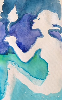
Tip: In case of a loss of white paper blot with damp towel and paint over with Golden absorbent ground. It is an opaque acrylic primer for water media that looks like and accepts paint like paper when it dries. In the illustration the head of the girl was too small until several layers of opaque, absorbent ground formed a hard edge. The profile of her face was further developed by carving into the white with more background color making a smaller more delicate cameo profile.
The leg was enlarged by just blotting the paint to make a larger light area. Then I added a very wet paint in the newly formed negative area. The extra wet area will form a line on the edge as it dries.
Below is a sample of my landscape painting: Landscapes tend to be more complex with a dominate subject and one or more supportive subjects. In very strong landscapes a group of subjects can be the focal point that draws the eye first. Secondary objects group together and will group with the space surrounding the dominate group or object.
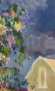
This is cropped from a much larger painting. It was the part of the painting most expressive of springtime.
A student's landscape with a dominate tree is a focal point because of the great dark light contrast. The road is a secondary focal point grouping with the dark grasses, trees and sky.

 During these two classes I was reminded that my students have some different needs and desires when they start to paint. Some come with an idea in their head but they don't have the skill set to paint. Some want to be entertained and expect to find painting relaxing. Some want their children to have the experience. The youngest child just is excited about the experience without any interest in the end product. Snatching their fun away before they are done is like taking away a toy.
The class reminds me of a painter who loved an evening ritual of turning on her favorite music, lighting candles then making a puddle of water on her paper in which she drops several different colors and watches as it dries. Very relaxing!


There are two different directions for watercolor painting. The best book for the traditional path is The Complete Watercolorist's Essential Notebook, by Gordon MacKenzie, North Light Books, ISBN-13: 978-1-4403-0905 The other direction is like the one in my exercise. For this more fluid approach using the character of paint an excellent guide is A Passion for Water Color, Painting the Inner Experience, by Stefan Draughon. Watson Guptilll publisher, ISBN 0-8230-0102-4
My next blog post will have links to artists who have used the principles in my painting exercise to advantage. They include Edward Hooper and Gustav Klimt.
1 comment:
This is interesting, I hope you keep going with it. Thanks for opening a window.
Post a Comment